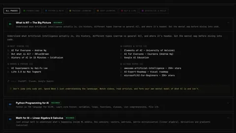
Accessibility fix shipped.
Thanks to my guide, Jean-Guy Leconte, who shared some feedback on the site: Some users struggled with the contrast between our black background and white text.
So I fixed it & shipped, and gave control back to the user.
What We did:
• Light / Dark / Auto toggle (OS-aware, saved)
• True high-contrast light mode (17:1 AAA)
• Improved brand colors for readability
• Theme-aware visuals (no more invisible labels)
(See video )